
 Share
Share
Making Brevo Automation
Web design has come a long way since the first website launched in 1991. Given that there are currently more than one billion active websites online, it should not come as a surprise that this industry is here to stay. So if you’re trying to learn more about the topic of web design, you’ve come to the right place.
This post will focus on the role of web design as a prelude to learning how to design a website, go through helpful advice, define key terms and concepts, and look at examples that will better your understanding.
What is Web Design?
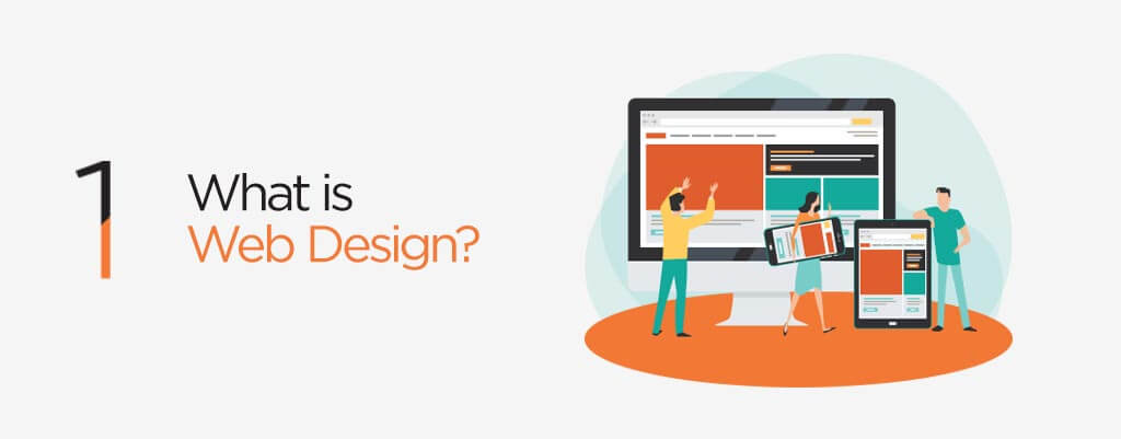
Web design is the process of arranging and structuring content on a website so that it can be shared and accessed by users everywhere. A website’s appearance, including the colours, fonts, and graphics used, as well as how it is structured and how users interact with it, are all influenced by web design, which blends aesthetic and functional elements.
Web design is frequently a collaborative process that integrates expertise and resources from related fields, including UX, SEO, and web design statistics. Web designers usually assemble experts from different domains who can maximise performance and concentrate on the more extended process and results.
What Are the Types of Website Design?

Responsive web design
The needs of the users and the devices they use are met through responsive web design. Depending on the size and capabilities of the gadget, the layout alters. On the phone, for instance, consumers might see content presented in a single-column perspective; on a tablet, the same content might be presented in two columns.
Screen sizes for phones, “phablets,” tablets, workstations, game consoles, TVs, and even wearables range widely. Your site must adapt to any screen size, whether it exists now or in the future, as screen sizes are constantly changing. Devices also come with various features that let us engage with them. For instance, some of your guests will use touchscreen technology. These factors are considered in contemporary responsive website design to enhance the user experience.
Adaptive web design
One way to guarantee that websites work on various device sizes is through adaptive design. Designers may create different-sized graphical user interfaces (GUIs) for devices like smartwatches and televisions. Multiple fixed layout sizes are employed in adaptive design for websites. The system determines the size of the browser and chooses the best layout. Similar to responsive design, which also adjusts to various screen sizes, is adaptive design. Responsive designs, on the other hand, employ a single layout that changes in response to screen size. Out of a variety of predefined layouts, adaptive design content selects the ideal configuration.
Static website design
A static website is made up of several HTML files, each of which physically represents a single website page. Each page on static websites is a different HTML file. You only see the actual homepage file when you visit the site. Even though a section of text on two pages is precisely the same, such as a footer, the footers nevertheless exist in two different versions. Therefore, you must alter the footer on each page if you want to. All websites were created using this method in the early years of the internet since static web pages are relatively simple to create.
Dynamic website design
Both static and dynamic web pages and websites are possible. Information that doesn’t automatically update can be found on a static website or static web page. Every visitor to the website sees the same thing, or it is stagnant. Information that changes depending on the user, the time of day, the time zone, the viewer’s native language, and other characteristics can be found on a dynamic website or dynamic web page.
Liquid website design
The liquid website layout, sometimes flexible or fluid, occurs when the site’s content can be adjusted to fit the screen’s resolution. A responsive website resizes itself to fit the resolution. CSS will make it less necessary to scroll down a web page to view content if you use it to develop a fluid website. Liquid layouts have certain benefits, but they also have some drawbacks. Some advantages and disadvantages of adopting a liquid website design are shown below.
Single-page website design
One-page or single-page websites are those that have just one page. In contrast to traditional “multi-page” websites, it lacks further internal links to pages like “Contact Us,” “Services,” and “Blog,” which are generally accessed by links in the “Menu.” Just a single page makes up the entire website. Many people prefer a one-page layout because of its ease of navigation, the clear and uncomplicated presentation, the quicker load time, and the simpler upkeep. Additionally, it was made using cutting-edge designs that are stunning to look at.
What are Some Web Design Jargons?

If you are new to the web design and development industry, you will be expected to understand many phrases and acronyms. We’ve gathered some of the most popular web design terminology to help clear any misunderstandings and give you a head start in the online world.
User Experience (UI)
The way a user interacts with the design of a page is known as the user interface. For instance, the battery indicator on your smartphone is a component of the user interface. Occasionally, UI and UX are combined, encompassing the website’s aesthetic appeal, responsiveness, and content.
Related: The Difference Between UI Design vs. UX Design
Wireframe
The functionality and structure of a website are planned using an outline known as a wireframe. It is often hand-drawn on paper and then created in grayscale in a program like Photoshop or Illustrator without any design elements like color, graphics, or text. In areas where text content would often be, Lorem Ipsum (or dummy) text is utilized instead.
Search Engine Marketing (SEM)
One of the best strategies for business expansion in today’s fiercely competitive market is SEM. It describes the technique of promoting a business through sponsored advertisements on search engines, such as brief copy, product listings, and video clips to attract users to your website. The biggest advantage of SEM for advertisers is the chance to present their goods to motivated buyers who are prepared to buy at the exact moment they are prepared to do so. SEM is a successful approach to expand your company since it accomplishes this in a way that no other form of advertising can.
Backlinks
Backlinks are connections to your website made by other websites. These help your website become more popular with search engines and eventually attract more visitors. Employing them properly is crucial because it’s also considered a basic SEO component. Your objective while constructing a backlink should be to obtain it from other credible content and pertinent websites.
Bounce Rate
The percentage of visitors to a website that leave after visiting just one page is known as the bounce rate. While a high bounce rate is not beneficial for a website, it can occasionally signify usable navigation and high-quality content.
Shopify
With the help of the subscription-based software Shopify, anyone may create an online store and sell their goods. Your inventory and products are synchronised if you are a Shopify merchant with both an online and offline presence, allowing you to manage your store from a single account on any device.
Landing Page
When visitors click a link or open a website, they “land” on a landing page. Frequently, a unique landing page is made in conjunction with a marketing or advertising effort to compel a new visitor to do a particular action. A smart landing page targets specific traffic and increases the conversion rate of visitors to your website.
Thank You Page
Visitors to your website are quickly directed to a thank-you page after entering your contact or inquiry form. A website’s thank you page can show how valuable it is to visitors. It should contain a message thanking the user for completing the form and directions on what to do next.
Google Analytics
Anyone with a Google account can utilise the freemium analytics program known as Google Analytics. It offers fundamental analytical tools, like statistics, which are beneficial for SEO and other marketing objectives. Because its service has some restrictions that make it less suitable for larger businesses, Google Analytics is perfect for SMEs.
Magento
Open source eCommerce platform Magento gives online retailers total flexibility. With excellent marketing, SEO, and catalog management capabilities, this platform gives users complete control over their online stores’ appearance, functionality, and content. Given that it comes in versions ranging from community open source to gigantic and large-scale enterprise Software as Service-based systems, we think Magento is one of the greatest eCommerce platforms currently accessible (SaaS).
Web Design Principles and Elements

Visual Hierarchy
According to Hick’s Law, making a decision takes longer the more options there are. This has happened to you countless times in restaurants. Making a dinner selection might be challenging on menus with numerous options. Making a decision would be considerably quicker if there were two possibilities available. The paradox of choice applies here; the more options you provide, the simpler it is to choose nothing.
With regard to web design, both principles are relevant. Your website becomes harder to use the more alternatives there are for a user to choose from. We must reduce options. Focus on removing distracting options throughout the design process to improve site design.
Fitt’s Law
According to Fitt’s law, the time needed to move to a target region (such as clicking a button) depends on both the target’s size and the distance to it. In other words, a thing is easier to utilise if it is more extensive and closer. They also put the play button conveniently on the mobile phone app. Not usually, bigger is better. We don’t need mathematical research to inform us that a button that occupies half the screen is a bad idea. Fitt’s Law is a binary logarithm anyway. In other words, rather than following a straight line, an object’s usability prediction outcomes go along a curve.
A tiny button becomes much easier to click when its size is increased by 20%, whereas a huge object doesn’t get the same usability advantages when it is increased by 20%.
Rule of Thirds
Including photos in your design is a wonderful idea. A graphic conveys your ideas far more quickly than text. The greatest pictures adhere to the rule of thirds, which states that an image should be divided into nine identical sections by two evenly spaced horizontal and vertical lines. Important compositional components ought to be positioned along these lines or where they converge. Using stunning, large photos help with good web design. Your website will be more enticing if your images are more intriguing.
Principles and Laws of Gestalt Design
Its fundamental tenet is that the human eye first perceives an object’s whole before detecting its component pieces. People first see your entire website, including the header, menu, footer, and other elements, when it comes to web design. We can forecast how others perceive things using eight so-called gestalt design principles. How each relates to web design is as follows:
Gestalt’s proximity principle
Things that are spatially close together are often grouped together. They merge into a single object that is seen. Make sure that elements that do not belong together are not seen as one for effective web design. You put similar design components together to convey that they form a whole (such as the navigation menu and footer).
Gestalt law of Similarity
We combine things that are related. This resemblance can take the form of shape, color, shading, or other characteristics.
Gestalt principle of Closure
We look for completion. Our perception fills in the visual gaps left by open shapes or missing pieces of an image. Even if neither of the shapes in the following image actually exists, we see a circle and a square.
Law of Symmetry
The brain views everything as being symmetrical and developing around a central point. Dividing objects into an even number of symmetrical segments is visually pleasant.
The mind perceptually connects two seemingly unrelated symmetrical pieces to generate a coherent shape when we perceive them.
Law of Common Fate
We frequently see items as lines travelling down a path. Objects that move similarly and travel in the same direction are grouped together.
People collectively group sticks and raise hands, pointing in the same direction in their minds. You can use this in the layout of your website to draw the user’s attention to something (e.g. a sign-up form, value proposition, etc.).
Gestalt’s principle of Continuity
People frequently assume that a line will continue in the same direction. When two objects (like lines) cross, we often consider them separate, uninterrupted entities. Even with overlap, the stimuli are still different.
White space and a simple aesthetic
White space, often known as “negative space,” is the web page area left “empty.” It is the space between columns, lines of text, margins, gutters, graphics, and other elements.
It is not just a “blank” space but a crucial component of web design. It makes things inside of it possible to exist. The usage of hierarchy for information, typography, color, or images is at the heart of white space.
Without any white space, a page jam-packed with text or pictures runs the danger of being crowded or congested. It’s typically challenging to read. This is why basic websites are better from a scientific perspective (people won’t even bother).
Occam’s Razor
Occam’s razor advises picking the competing theory that requires the fewest assumptions and provides the most straightforward explanation when presented with numerous competing ones. This principle asserts that the simplest answer is typically the best in terms of web design.
What are Common Web Design Taboos?
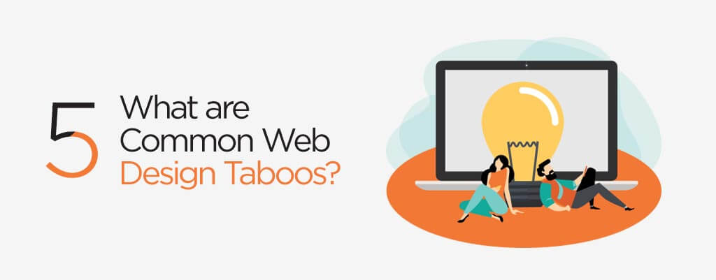
While making mistakes is a natural part of the design process, we’re here to help you avoid some of the most common blunders that business teams and website owners make. This article explores the five most common web design mistakes and suggests ways to prevent them.
Poor calls to action (CTAs)
Many websites contain subpar calls-to-action (CTAs) that don’t effectively direct visitors to complete particular tasks or actions. You must provide your website visitors with clear, simple-to-understand CTAs to do the step you need them to. Lower sales, opt-ins, and conversions result from this.
Too many items on the website
Design teams frequently need to catch up on the need for clarity as they become overly passionate about the variety of content they want to offer on their website. The outcome? a user interface (UI) cluttered and excessively complex, leaving customers feeling overloaded and bewildered.
An effective website allows users to navigate easily and simply without extraneous clutter. Avoid using too many different fonts and colours, and make sure there are only a few photos, buttons, or other media pieces competing for the attention of your consumers to produce a clear and straightforward browsing experience.
Not adapting to various devices
Users use websites roughly equally on mobile and desktop devices; thus, your web design must be flawless across all screen sizes. You will lose out on traffic, conversions, and revenue on mobile or desktop interfaces if you don’t prioritise responsive design.
Inadequate accessibility
If your website is not inclusive and accessible, you will significantly reduce the number of users interacting with it. For instance, with almost one billion people globally, individuals with disabilities make up the largest minority in the world. Without accessible design, you’ll likely lose traffic and conversions, miss opportunities to improve the user experience for all users, and miss out on interacting with a sizable user group.
Unclear navigation and communication
Users will click away from your website without fully knowing what your site and product are about due to confusing website layouts and poor communication, resulting in a bad user experience. Planning your website around user demands may prevent users from becoming lost or frustrated as they navigate. By incorporating user feedback into your website design at every level of the process, you can avoid assumptions like assuming people already understand your solution and know what to do on your site.
Best Practices for Website Design

It’s simple to fixate on aesthetics when developing or remodelling a website. But to give you a place to start, we’ve compiled a list of the core principles and best practices you may use for your subsequent website redesign or launch.
Simplicity
While your website’s aesthetics are unquestionably significant, most visitors aren’t checking it out to see how sleek the design is. They seek to accomplish a task or discover a particular piece of knowledge. Unnecessary design components, or those with no functional purpose, will, therefore, confuse and make it more difficult for visitors to achieve their goals.
This principle can be applied in a variety of ways, including:
- Generally speaking, don’t use many colours. Keep your design’s colour palette to a maximum of five (plus or minus two) different hues.
- If you use any script fonts, keep them to a minimum and use highly legible typefaces. Keep text colours to a minimum once more, and ensure they always contrast with the backdrop hue. Using a maximum of three different typefaces in a maximum of three different sizes is popular advice.
- Use graphics sparingly and only when necessary to a user’s ability to complete a job or perform a specific function.
Navigability
It’s essential to design user-friendly navigation on your website to make it easier for visitors to find what they’re looking for. Visitors should arrive at your website and spend little time deciding what to click on. There should be as little resistance as feasible when moving from point A to point B.
Here are some pointers for improving the navigation on your website:
- Keep the major navigation structure straightforward (and near the top of your page).
- Incorporate navigation into your website’s footer.
- Consider employing breadcrumbs on all pages (other than your homepage) to help users remember where they came from.
- Add a search bar at the top of your website so that users may look up specific terms.
Consistency
In addition to maintaining consistency in your navigation, your site’s pages should have the same general look and feel. Consistency improves usability and user experience in the background, colour schemes, typefaces, and writing style.
Not every page needs to have the same layout, though. Instead, design distinct layouts for particular page kinds (e.g., landing pages, informational pages, etc.). Visitors will find it simpler to comprehend what type of content they will see on a specific page if they use those layouts regularly.
Conventionality
Finding a balance between creativity and expectations is difficult when designing websites. Most of us are seasoned internet users and have developed certain habits over time. These conventions consist of the following:
- The main navigation is positioned at the top (or left side) of a page.
- Putting a logo in the page’s top left (or centre).
- Making the logo clickable to ensure that it always redirects users to the home page
- When you hover over links and buttons, they change colour or look.
- Using the shopping cart symbol on an online store. The number badge on the icon indicates how many things are currently in the cart.
- Ensuring that controls for manually rotating slides are included on picture sliders.
Defining Web Development vs Web Design
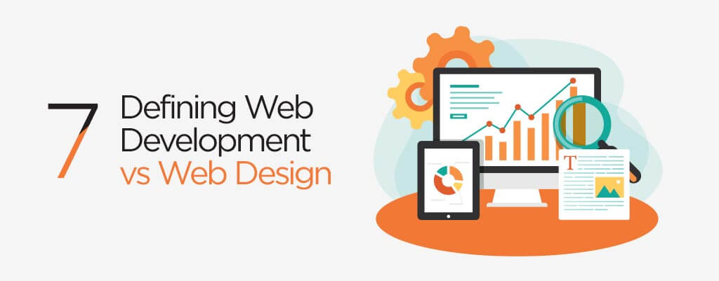
The term “web design” mainly refers to the procedures needed to make the section of a website that website visitors view visually appealing and easy to understand. Web designers ensure that the website has a professional appearance and that users can navigate it easily. They are also known as “UX” designers or user experience designers.
The programming that goes on in the background to make a website function is the focus of web development. While a web designer may design a button, a web developer makes sure that something happens when the button is clicked. Web designers may concentrate on the front end of the website (more visually, what the user sees), the back end (more functionally, how the website functions), or both. For instance, a back-end developer would create code to link an e-commerce site’s shopping cart to a safe online payment processing system. In contrast, a front-end developer might utilise CSS (cascading style sheets) to decide how a homepage is laid up.
Must-Have Skills to Become a Web Designer

There are a few key competencies you must acquire if you want to develop into a well-rounded, professional web designer, whether you work for a company or independently.
Visual aesthetic
Visual design principles are the initial set of abilities you’ll need to learn to excel in web design. The visual design combines graphic design and UI (User Interface) design. A skilled visual designer may provide visually pleasing and useful designs in resolving issues for a company. You’ll need to be proficient in the fundamental visual design principles of colour, layout, and typography.
UX
User experience, or UX, is a talent that centres on how customers engage with a product. Both research and design are involved. Web designers may create interesting and user-friendly experiences for website visitors by having a firm grasp of UX principles. UX is crucial for developing websites that help users solve their problems.
Related: User Experience Design Services – Why is UX Design Important?
Front-end development
HTML and CSS are the building blocks of every website. These two front-end languages are fundamentally the building blocks of the web. Web designers should be proficient in HTML and CSS, even if they don’t write much code. Nowadays, visual website builders like Webflow and Squarespace make it unnecessary to create a website from scratch. But learning HTML, CSS, and even JavaScript opens up new possibilities for website personalisation.
Design applications
To build and develop websites, there are a few different tools and applications web designers need to know. First, designers must use design tools to produce the final designs. If you enjoy using Adobe products, XD is a fantastic wireframing and prototyping tool. Working knowledge of Photoshop and Illustrator is also beneficial for producing unique designs. The well-liked XD substitutes Figma, Sketch, and InVision. Even though many designers have strong preferences for specific tools, any of the applications listed here would be effective.
Why is Web Design Important in Today’s World?

Your audience gets their first impression of your company when they visit your website. They’ll make an instant judgement of your company. You want to impact your audience in the opening seconds positively.
If your website looks outdated or unattractive, your viewers will generate a negative opinion of your business right away. Because they won’t find your website appealing, they will leave your page.
Because it affects how your audience views your brand, web design is crucial. The first impression you provide them will determine whether they stay on your page to learn more about your company or whether they click on a competitor’s page instead. You can keep leads on your page longer with effective web design.
Find Out All About Web Design Only From the Best in Singapore

The layout of your website has a big impact on how successful your online marketing campaign is. Creating a website that encourages people to learn more about your company will help you achieve the best results for your organisation. We at Verz Design have been designing websites for many years. We are a full-service digital marketing firm focusing on creating unique websites. Your campaign will benefit from the knowledge and experience of our team of professionals. We can assist you in building a website you’ll enjoy since we understand how important web design is.
To schedule a free consultation, call +65 6841 1680 or email sales@verzdesign.com right away!
About the Author:

Julian Wong
Specializes in creating impactful content tailored for digital strategies, blending creativity and insights to drive engagement and results.
Contributors:
-

Nancy Choo
SEO Specialist
-

Claire Wan
SEM Expert
Need a strong team specialised in SEO?
Speak to Verz today if you are looking to create a website with a
lasting impression to achieve online success.


Let’s Get Started!
Connect with us
We would love to hear from you. Drop us a line and we’d love to schedule a time to get to know your needs better.
- enquiry@verzdesign.com
- +65 6841 1680
- 56 Kallang Pudding Road,
#07-05/06 HH@Kallang
Singapore 349328 - https://www.verzdesign.com
- enquiry@verzdesign.com
- +65 9725 4220
- Level 28, The Gardens South Tower, Mid Valley City,
Lingkaran Syed Putra, 59200 Kuala Lumpur, Malaysia - https://verzdigital.com.my
- enquiry@verzdigital.com.ph
- +63 920 914 8537
- 29th Floor, Joy Nostalg Center 17 ADB Avenue Ortigas,
Metro Manila Philippines - https://verzdigital.com.ph
- enquiry@verzdesign.com
- VerzDesign2024
- 3-8/F, No. 35, Loushanguan Road, Changning District, Shanghai
上海市长宁区娄山关路35号3-8楼 - https://www.verzdesign.com
