70 Best Sans Serif Fonts for Modern Logo Design
Below are 70 carefully selected sans serif fonts for logo design, categorised by style.
Geometric & Modern Sans Serif Fonts
1. 7 Days

A futuristic sans serif font with sharp geometry and connected letterforms. Ideal for tech startups and digital brands seeking a high-tech aesthetic.
2. Brandon Grotesque

Designed by Hannes von Döhren, this geometric typeface blends warmth with structure. Popular in corporate branding and editorial design.
3. Azedo

A creative geometric font with distinctive curved strokes. Suitable for playful or youth-oriented branding.
4. Axis

Minimal and uniform, Axis offers strong structural clarity. Works well for sports brands and modern publications.
5. Aqua Grotesque

Inspired by 1940s typography, this clean sans serif font features generous spacing and elegant proportions.
6. Modeka

A modern geometric typeface with thin stems and sharp edges. Best suited for minimalist technology brands.
7. Shkoder 1989

A bold display sans serif font influenced by 90s design culture. Effective for energetic branding.
8. Grafika

A minimalist and versatile font family suitable for diverse industries and logo customisation.
9. Reckoner

Industrial-inspired and tall in structure, this typeface adds strength and edge to bold branding.
10. Quantify Bold
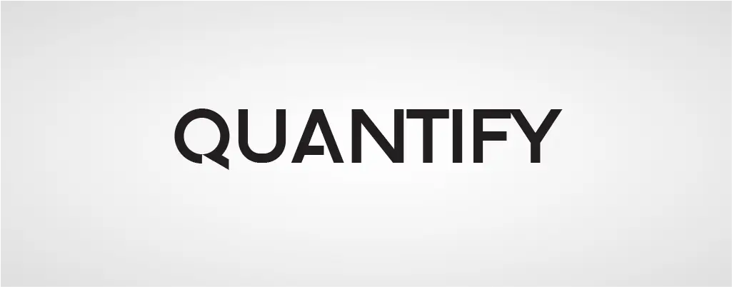
Recognisable for diagonal white-space cuts in its letterforms. Ideal for IT and digital solution companies.
Humanist & Friendly Sans Serif Fonts
11. Quicksand

A rounded geometric sans serif font inspired by early 20th-century design. Clean yet approachable.
12. Minimalust

Handcrafted and soft-edged, perfect for travel, lifestyle, and creative brands.
13. Dense

Structured and compact, offering clarity for minimalist identities.
14. Akrobat

A neo-grotesque sans serif font with condensed proportions, suitable for corporate branding.
15. Break Fill

Stylish and contemporary with strong visual presence for fashion or travel brands.
16. Arkhip

Bold and distinctive with Eastern European character influence. Effective for sports or energetic brands.
17. Bavro

Clean, rounded, and friendly. Works well for creative or lifestyle brands.
18. Melbourne

Sharp, condensed, and modern. Suitable for professional and office branding.
19. Gasalt

Game-inspired geometric sans serif font with smooth curves and tech appeal.
20. Aquawax

Balanced sharpness and softness with fluid transitions, suitable for water and tech industries.
Corporate & Web-Safe Sans Serif Fonts
21. Aspergit

Retro-inspired with balanced thin strokes. Ideal for lifestyle brands.
22. Intro Condensed

Lightweight, highly legible, and excellent for minimalist brand identities.
23. Advent

Modern and futuristic, offering distinctive uppercase styling for branding.
24. Seagle

Open counters and masculine geometry, strong for manufacturing brands.
25. Rosarina

Minimalist and refined, suitable for feminine branding.
26. Steiner Light

Smooth and circular, conveying elegance and approachability.
27. Walkway

Thin and contemporary, suitable for fashion and apparel brands.
28. Dekar

Modern geometric font with unique upper strokes in letters like “W”.
29. Qanelas Soft

A softer geometric sans serif font ideal for friendly corporate identities.
30. Helvetica Now

A refined evolution of Helvetica, offering improved digital readability and multiple optical sizes.
31. Proxima Nova

One of the most widely used commercial sans serif fonts for web and branding.
32. Futura

A classic geometric sans serif font based on circles and triangles. Timeless and highly versatile.
33. Public Sans

Developed for the U.S. Web Design System. Clean, neutral, and optimized for digital interfaces.
34. Jam Grotesque

Inspired by Helvetica and Neue Haas Unica, suitable for branding and apparel.
35. VVDS Fifties

Blends geometric and humanist styles, offering wide stylistic versatility.
Display & Tech-Focused Sans Serif Fonts
36. Audiowide

Technology-inspired display sans serif font with soft corners and tubular forms.
37. Laro Soft

Modern and versatile with multiple weights, suitable for branding and packaging.
38. Open Sans

Highly readable and widely used across digital platforms.
39. Olarwe

Elegant tagline font with multilingual support and stylistic alternates.
40. Vilane

Bold statement font family ideal for social media and packaging.
41. Code Next

Constructive, clean, and multi-script ready for modern digital projects.
42. Monaco (Display Version)

Minimal and thin for luxury and headline usage.
43. Spacia

Handcrafted minimalist font with strong OpenType support.
44. Inter

Highly legible variable sans serif font designed for digital interfaces.
45. Innovate

Bold and modern, suited for branding and promotional graphics.
46. Extatica

Narrow display sans serif font available in multiple weights and italics.
47. Visby

Airy geometric font with wide language support and strong personality.
48. Gilmer

Geometric, near-monoline typeface inspired by Futura and Avant Garde.
49. Nexa

Contemporary geometric font family widely used in branding.
50. Lato

Friendly and warm sans serif font with broad global adoption.
Corporate & Web-Safe Sans Serif Fonts
51. Roboto

Google’s neo-grotesque typeface designed for Android and digital interfaces.
52. Oswald

A reworking of Alternate Gothic optimised for screens.
53. Orbitron

Futuristic geometric font ideal for tech branding.
54. Signika

Designed for signage and clarity at distance.
55. Articulat CF

Clean geometric typeface with balanced rhythm.
56. Jost

Digitally optimised geometric font inspired by Futura.
57. Stellar

Condensed modern font for headlines and branding.
58. Garet

High x-height geometric typeface with variable font support.
59. Greycliff

Near-monoline font family ideal for UI and branding.
60. Amicale

Modern professional font family for clean branding.
Multilingual & International Sans Serif Fonts
61. Etna

Modern multi-weight typeface inspired by wood type aesthetics.
62. Sarabun

Open-source multi-script sans serif font supporting Latin and Thai.
63. Prompt

Loopless Thai and Latin typeface suitable for editorial use.
64. Alyssum

Delicate and elegant, suitable for weddings and feminine branding.
65. Sprout

Thin condensed display sans serif font for elegant designs.
66. Gayathri

Modern Malayalam display typeface.
67. Livvic
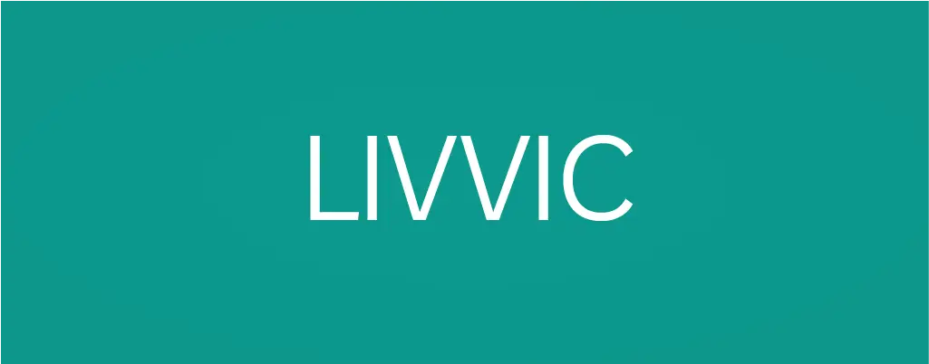
Corporate-focused modern typeface developed for brand identity systems.
68. Aqua Grotesque (Alt Versions)
Expanded stylistic usage for fashion and editorial branding.
69. Break (Original Version)
Modern structured display sans serif.
70. Intro (Full Family)
Extensive weight system ideal for scalable brand identities.