A potential customer finds your website through Google Search on their phone. They arrive and immediately hit a wall: text too small to read without zooming, a navigation menu that doesn’t quite work with their thumb, a contact form with fields crammed too close together, and a page that takes four seconds to load on a 4G connection.
They leave. Your bounce rate goes up. Google notices. Your rankings drop. And somewhere, a competitor whose website was built properly on mobile picks up the enquiry you just lost.
This is not a rare edge case. Over 60% of global web traffic now comes from mobile devices. More than half of mobile websites still fail Google’s own performance standards. And most of the underperforming ones aren’t broken, they’re technically responsive. They just weren’t built mobile-first.
That distinction matters enormously in 2026. This article explains what’s going wrong and exactly how to fix it.
Mobile-First vs Responsive Design: What’s the Actual Difference?
These two terms get used interchangeably and they’re not the same thing. Understanding the distinction is the first step to fixing your mobile experience.
Responsive Design
Responsive design means your website adjusts its layout to fit different screen sizes. It uses CSS media queries to reformat content depending on the width of the browser window. A responsive site will look different on a phone than on a desktop.
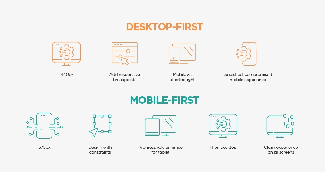
The problem is in how most responsive sites are actually built: desktop first. The designer creates the full desktop layout with all its columns, sidebars, large images, hover menus, and detailed content and then adds mobile breakpoints afterwards to scale everything down. The mobile version is an afterthought. A compressed version of the desktop. And it shows.
Mobile-First Design
Mobile-first design inverts this completely. You start by designing for the smallest screen typically 375px wide, the width of a modern iPhone and then progressively enhance the experience for larger screens. Every content decision, every button size, every navigation choice is made with the phone user as the primary audience.
This approach, coined by Luke Wroblewski (now a Product Director at Google) in 2009, forces a clarity that desktop design never demands. When you have 375px and one thumb to work with, you can’t afford to include anything that isn’t genuinely important. The result is a cleaner, faster, more focused website for everyone.
Factor
Desktop-First (Responsive)
Mobile-First
Starting point
Design for 1440px desktop, then scale down
Design for 375px mobile, then scale up
Mobile experience
Compressed version of desktop often clunky
Purpose-built for mobile clean and intentional
Performance
Desktop assets loaded on mobile, slow
Only essential assets loaded first
Priority decisions
Desktop content priorities assumed
Forced to identify what truly matters to users
Touch design
Usually retrofitted not native
Built in from day one touch targets, thumb zones
Google indexing
Mobile version often inferior hurts rankings
Mobile version is the primary version better rankings
Content hierarchy
Desktop information architecture cloned
Content pruned for mobile utility first
Why Mobile-First Design Matters Right Now?
The gap between how many people browse on mobile and how well most websites serve them is where the business cost lives. The numbers tell a clear story.
The mobile conversion gap is worth dwelling on. Mobile accounts for 70%+ of eCommerce browsing sessions, but converts at roughly half the rate of desktop. That gap isn’t because mobile users don’t want to buy it, but because the experience on most mobile websites makes completing a purchase harder than it needs to be. Bad navigation, slow loading, forms that are frustrating to fill out, and trust signals that get hidden when the layout compresses.
And since March 2024, there is no opt-out from Google’s mobile-first indexing. Every website including yours is now crawled and indexed by Google in its mobile version. If your mobile experience is poor, your rankings will reflect that regardless of how polished your desktop site looks.
According to Google’s mobile-first indexing documentation, since March 2024, Google has used the mobile version of every website for crawling and indexing. Content available only on desktop may not be seen by Google.
Why Responsive Layouts Fail: The 7 Most Common Problems?
Most Singapore websites aren’t broken on mobile, they’re just disappointing. Here are the specific patterns we see most frequently when auditing responsive websites that aren’t performing as well as they should.
1. Touch Targets That Are Too Small
Problem: Buttons, links, and interactive elements that look fine on desktop become almost impossible to tap accurately on mobile. Google’s minimum recommendation is 44×44 pixels for touch targets, with 8px of spacing between them. The typical desktop-first site has links and buttons sitting far below this threshold.
Fix: Increase button padding so all interactive elements are at least 44x44px. On mobile specifically, aim for 48x48px with 8px of space between adjacent targets. This alone can significantly reduce mobile rage clicks and missed interactions.
2. Page Load Speed Not Optimised for Mobile Networks
Problem: Desktop-first sites are built for fast broadband connections. When those same assets (high-resolution hero images, multiple third-party scripts, large font files) are served to a user on a 4G or even 3G connection, load times spike. Every 100ms of additional load time costs approximately 1% in conversions.
Fix: Compress images to WebP format, implement lazy loading for images below the fold, defer non-critical JavaScript, use a CDN, and remove unused CSS. Target LCP under 2.5 seconds on mobile. For Singapore businesses: test on a simulated mobile network in Chrome DevTools the results are often eye-opening.
3. Navigation That Doesn’t Work With a Thumb
Problem: Desktop navigation menus with many items, deep dropdowns, and hover-dependent interactions fail completely on touchscreens. There’s no hover state on a phone. A navigation structure that works perfectly with a mouse cursor can be completely unusable with a thumb.
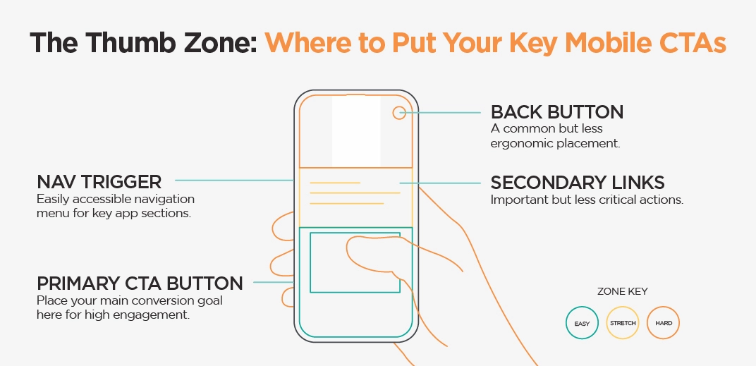
Fix: Implement a hamburger menu or bottom navigation bar for mobile. Limit primary navigation to 5–7 items maximum. Avoid hover-dependent interactions entirely. Consider thumb-zone analysis the bottom third of a phone screen is the most comfortable to reach. Put your primary CTA there.
4. Text That’s Too Small or Too Dense
Problem: Body text set at 14px on desktop often renders too small on mobile especially combined with narrow line spacing and little padding. Walls of text that are manageable on a widescreen become overwhelming scrolling on a 375px screen.
Fix: Set minimum body text at 16px for mobile (smaller than 16px causes iOS Safari to auto-zoom, breaking the layout). Use a line height of at least 1.5. Add generous padding around content blocks. Breaking long paragraphs into shorter ones that feels like a natural paragraph length on desktop often feels like an essay on mobile.
5. Pop-Ups and Interstitials That Block Mobile Content
Problem: Full-screen pop-ups, newsletter sign-up modals, and chat widget overlays that are merely annoying on desktop become completely blocking on mobile covering the content the user came to see. Google actively penalises sites using intrusive interstitials on mobile.
Fix: Use banners instead of full-screen overlays on mobile. If a pop-up is necessary, trigger it only after the user has scrolled at least 50% of the page not on entry. Ensure it has a clearly visible, easy-to-tap close button of at least 44x44px. Avoid interstitials entirely on key landing pages.
6. Forms That Are Painful to Complete on Mobile
Problem:Long forms with many fields, missing autocomplete attributes, no input type specifications (so the right keyboard doesn’t appear), and submit buttons that are hard to reach make completing enquiry forms or checkout processes on mobile unnecessarily difficult.
Fix: Use the correct HTML input types (type=’email’, type=’tel’, type=’number’) so mobile keyboards adapt appropriately. Add autocomplete attributes. Reduce form fields to the absolute minimum every extra field reduces completion rates. Put the submit button where thumbs can reach it. Test form completion on a real device, not a desktop simulator.
7. Images Not Sized or Formatted for Mobile
Problem: Serving a 2400px wide hero image to a 375px mobile screen wastes bandwidth, slows load time, and inflates LCP scores. Unoptimised images are the single most common cause of LCP failures on mobile and LCP only achieves ‘Good’ status on 62% of mobile pages.
Fix: Use srcset to serve appropriately sized images for each screen size. Convert all images to WebP format (30–40% smaller than PNG/JPG at equivalent quality). Set explicit width and height attributes on all images to prevent Cumulative Layout Shift. Implement lazy loading for below-the-fold images. Use responsive image CSS max-width: 100%.
How do the three design approaches score on real mobile performance metrics?
Mobile Website Readiness Score
Approach 01
Desktop-First
Designed for desktop,
then squeezed for mobile
42
Needs improvement
Core Web Vitals 14/30
Touch UX quality 8/20
Load performance 9/20
Mobile SEO 7/20
Conversion rate 4/10
Approach 02
Responsive Only
Adapts to screens but
not built for mobile
71
Average
Core Web Vitals 22/30
Touch UX quality 14/20
Load performance 16/20
Mobile SEO 12/20
Conversion rate 7/10
Recommended
Approach 03
Mobile-First
Built for mobile first,
enhanced for desktop
94
This score is great
Core Web Vitals 29/30
Touch UX quality 19/20
Load performance 20/20
Mobile SEO 18/20
Conversion rate 8/10
Scores derived from Core Web Vitals benchmarks, UX heuristics, and conversion rate data. Sources: 2025 Web Almanac (HTTP Archive), Google CrUX, BrightEdge 2026.
Core Web Vitals: The Hidden Mobile Performance Crisis
Google’s Core Web Vitals are three specific metrics that measure the real-world performance of a page for actual users. Since June 2021, they’ve been a confirmed ranking signal. Since the March 2026 core update, their weight in Google’s algorithm increased significantly.
Here’s what they measure and why they matter specifically for mobile:
LCP
INP
CLS
Target: Under 2.5 seconds
Mobile pass rate: 62% of mobile pages
Target: Under 200ms
Mobile pass rate: 77% of mobile pages
Target: Under 0.1
Mobile pass rate: 81% of mobile pages
The hardest metric to pass measures how fast your main content loads. Failing LCP is the most common reason Singapore sites miss their overall CWV pass.
Measures how quickly your page responds when users tap or click. Replaced FID in March 2024. Pages with INP above 300ms suffer 31% more traffic loss on mobile.
Measures visual stability how much elements shift as the page loads. Missing width/height on images is the most common cause. Particularly jarring on mobile.
According to the 2025 Web Almanac, 48% of mobile pages pass all three Core Web Vitals, up from 32% in 2021 and 44% in 2024.
The business cost of failing Core Web Vitals is concrete. Pages with poor LCP above 3 seconds experienced roughly 23% more traffic loss than faster competitors with similar content quality (Eclipse Marketing, 2026). Poor INP above 300ms caused around 31% drops specifically on mobile. And improving load time from 3 seconds to 1 second can cut bounce rate by 32% and boost organic traffic by 15%.
WordPress powers 43% of all websites, yet according to the 2025 Core Web Vitals CMS rankings, only about 43% of WordPress websites on mobile pass all three Core Web Vitals.
What Mobile-First Design Actually Looks Like in 2026?
Understanding the problems is one thing. Knowing what good looks like is another. Here’s what a genuinely mobile-first approach involves at a practical level.
Start at 375px Not 768px
Mobile-first design begins at the smallest common smartphone width, not at the tablet breakpoint. Many teams claim to be ‘mobile-first’ but actually start at 768px, which is an iPad width not a phone. If your design doesn’t look intentional and clean at 375px, it isn’t mobile-first.
Content Hierarchy: What Gets Priority?
Mobile forces a content hierarchy decision that desktop design can defer. On a 375px screen, there’s no room for everything at once. A mobile-first approach starts by asking: what is the single most important action we want a mobile user to take on this page? That CTA goes at the top, within thumb reach. Everything else is ordered below it by declining importance.
For a Singapore service business, this often means: company name + one-line value proposition + phone number or ‘Book a Consultation’ button all above the fold on mobile. The 15 paragraphs about your company history go further down.
Thumb-Zone Design
The thumb zone is the area of a phone screen that’s comfortable to reach without shifting grip. On a standard smartphone held in one hand, the bottom third of the screen is the sweet spot; the top corners require a stretch. Mobile-first designers put primary actions (CTA buttons, navigation triggers, form submit buttons) in thumb-comfortable zones. Secondary actions can live higher up.
Typography and Spacing Built for Small Screens
Mobile-first typography starts at the right scale. Body text at 16–18px. Headings that are large enough to scan but don’t dominate the entire viewport. Line height at 1.5 or higher. Generous padding around content blocks 16–24px horizontal padding so text doesn’t sit flush against screen edges. Fluid typography using CSS clamp() adjusts type size smoothly across screen widths without fixed breakpoints.
Performance as a Design Constraint
Mobile-first design treats performance as a constraint from the start, not an optimisation to do afterwards. Images are specified at mobile sizes first. Only the JavaScript that’s genuinely needed on mobile is included by default. Font files are limited to one or two weights. The goal is a sub-2-second LCP on a mid-range device on a 4G connection.
2026 CSS Approaches: Container Queries and Fluid Typography
Two CSS features have become standard in 2026 that genuinely improve on old responsive design approaches:
Container queries: Instead of elements responding to the browser viewport width, they respond to the size of their containing element. This makes components more portable and less dependent on specific breakpoints.
Fluid typography with clamp(): Instead of switching between fixed font sizes at breakpoints, type scales fluidly. For example: font-size: clamp(1rem, 2.5vw, 1.5rem) scales smoothly from 16px on mobile to 24px on large screens without any abrupt jumps.
How to Audit Your Website’s Mobile Performance?
Before fixing anything, you need to know what’s actually failing. Here’s a structured audit process for Singapore businesses with no technical background required for the early steps.
Step 1: Google PageSpeed Insights (Free)
Go to pagespeed.web.dev and enter your URL. Switch to the Mobile tab. This shows your Core Web Vitals scores, what’s failing, and specific recommendations. Focus on the ‘Opportunities’ and ‘Diagnostics’ sections; these tell you exactly what to fix.
Step 2: Google Search Console Mobile Usability Report
In Google Search Console, go to Experience → Mobile Usability. This shows which pages Google has flagged as having mobile usability issues: clickable elements too close together, content wider than screen, viewport not configured, text too small. These are the issues Google is already penalising you for.
Step 3: Test on a Real Device
Emulators in Chrome DevTools are useful but not the same as testing on a physical device. If possible, test on a mid-range Android phone not the latest iPhone Pro or a flagging simulator. Mid-range Android represents the device most of your less tech-savvy Singapore customers are likely using. Walk through the following journey: land on the homepage, navigate to a service page, find the contact details, complete the enquiry form.
Common finding: Many Singapore businesses discover their enquiry form is nearly impossible to complete on a real mobile device small fields, no input type specifications (so the wrong keyboard appears), and a submit button buried below the fold. This alone can account for a significant portion of lost mobile enquiries.
Step 4: Run Google’s Mobile-Friendly Test
At search.google.com/test/mobile-friendly, this is Google’s own tool showing whether it considers your pages mobile-friendly. Also use the URL Inspection tool in Search Console to see your page as Googlebot sees it on mobile; this is the definitive view of what Google indexes.
The 2026 Mobile-First Fix Checklist
Once you know what’s failing, here’s the prioritised fix order. Technical difficulty is indicated: [Low] = no developer needed, [Medium] = developer required, [High] = significant development work.
Fix
Action Required & Why
Viewport meta tag [Low]
Ensure <meta name=’viewport’ content=’width=device-width, initial-scale=1′> is in every page’s <head>. Without this, mobile browsers render your site at 980px and scale it down breaking everything.
Image compression [Low–Medium]
Convert all images to WebP format (30–40% smaller). Add lazy loading to images below the fold. Set explicit width and height attributes to prevent CLS. Use srcset for different screen sizes.
Touch target sizes [Medium]
Audit all buttons, links, and form elements. Minimum 44x44px with 8px spacing between adjacent targets. Increase button padding rather than button text size.
Body text minimum 16px [Low]
Anything below 16px on mobile triggers iOS auto-zoom. Set base body font-size to 16px minimum. Use clamp() for fluid scaling.
Remove/redesign pop-ups [Low–Medium]
Replace full-screen modals with slide-in banners on mobile. Ensure all overlay close buttons are at least 44px. Don’t trigger modals on page load.
Fix navigation [Medium]
Implement a hamburger menu for mobile. Limit to 5–7 items. Ensure dropdown items are large enough to tap. Test with a real thumb, not a cursor.
Optimise LCP [Medium–High]
Preload the largest above-fold image. Defer non-critical JS. Remove render-blocking resources. Use a CDN. Target < 2.5 seconds on mobile. This is the most impactful fix for rankings.
Fix INP [High]
Reduce JavaScript execution time. Break up long tasks. Use web workers for heavy processing. Defer third-party scripts. Target < 200ms. Most commonly caused by heavy WordPress plugins.
Fix CLS [Medium]
Add width and height to all images and videos. Reserve space for ads and embeds. Avoid inserting content above existing content after load.
Fix forms for mobile [Medium]
Add type attributes to all inputs. Add autocomplete. Reduce to essential fields only. Test completion on a real device. Move submit button to within thumb reach.
Add llms.txt [Low]
Add your llms.txt file and ensure AI crawlers are unblocked in robots.txt. Mobile-optimised sites are more likely to be cited by AI systems that evaluate page quality.
Schema markup [Medium]
Add Organisation/LocalBusiness schema. Ensure schema reflects your mobile-visible content. Google validates schema against the mobile version of your pages.
Mobile Performance and AI Search Visibility
There’s a connection between mobile performance and AI search visibility that isn’t often discussed.
Google AI Overviews draw from pages that meet Google’s quality standards and Core Web Vitals are part of those standards. A page that fails LCP, CLS, or INP on mobile is signalling to Google that it doesn’t provide a good user experience. That makes it less likely to be cited in AI-generated summaries, not because AI specifically checks Core Web Vitals, but because the overall quality assessment that informs AI citation pulls from the same signals Google uses for ranking.
More directly: a January 2026 Search Engine Land analysis of 107,000+ pages found that Core Web Vitals have a weak direct correlation with AI Overview citation on their own but the overall page quality picture (which includes mobile performance, content quality, and technical health together) does matter for citation eligibility.
The practical takeaway: fixing your mobile experience improves your Google rankings, improves your user experience, improves conversion rates, and creates the technical foundation from which AI search visibility can be built. It’s not a separate track, it’s the foundation. If you’re looking to improve how your business appears in AI-powered search experiences such as ChatGPT, Perplexity, Gemini, and Google AI Overviews, our Generative Engine Optimisation (GEO) services can help you build that visibility.
Conclusion
A website that’s technically responsive and a website that’s genuinely built mobile-first are not the same thing, and in 2026, that difference shows up directly in your Google rankings, your Core Web Vitals scores, your bounce rates, and your conversion numbers.
The good news is that the problems are specific and the fixes are well-understood. Touch targets are too small, load speeds are not optimised for mobile networks, navigation that doesn’t work with thumbs, fonts too small, forms too frustrating, images too large each of these has a clear solution. And for most Singapore businesses, addressing even three or four of these issues will produce measurable improvements in both search performance and mobile conversion.
The standard has moved. Responsive design was the innovation of 2012. Mobile-first is what 2026 expects. If your Singapore website was built more than two years ago without a dedicated mobile audit, there’s a very good chance it’s losing you business every day from mobile visitors who leave before converting. Ready to turn more mobile visitors into customers? Work with Verz Design to build a website that’s designed for performance from the start.
Frequently Asked Questions
What is mobile-first design and how is it different from responsive design?
Responsive design means your website adapts its layout to different screen sizes. Mobile-first design is a specific approach to building responsive websites you design for the smallest screen (typically 375px, a standard smartphone width) first, and then progressively enhance the experience for larger screens. The key difference: mobile-first treats mobile as the primary experience. Most responsive websites are built desktop-first and then scaled down, which is why mobile versions often feel like compromised versions of the 'real' site.
Why does Google care about mobile-first design?
Since March 2024, Google has used mobile-first indexing for all websites, meaning it crawls and indexes your mobile version and uses it to determine your rankings. If your mobile experience is poor, loads slowly, or has usability issues, those failures directly affect your search visibility regardless of how your desktop site performs. Core Web Vitals, which are measured primarily on mobile, have been a confirmed ranking signal since 2021, with their weight in the algorithm increasing in the March 2026 core update.
What are Core Web Vitals and why do they matter for my website?
Core Web Vitals are three metrics Google uses to measure real-world page experience: LCP (Largest Contentful Paint) how fast your main content loads, target under 2.5 seconds; INP (Interaction to Next Paint) how quickly your page responds to user interactions, target under 200ms; and CLS (Cumulative Layout Shift) how stable your page is as it loads, target under 0.1. According to the 2025 Web Almanac, only 48% of mobile pages pass all three. Sites that fail Core Web Vitals risk ranking lower and losing up to 8–35% in conversions and revenue.
How do I know if my Singapore website has mobile performance issues?
Start with Google's free tool: pagespeed.web.dev enter your URL and check the Mobile tab for your Core Web Vitals scores and specific recommendations. Also check Google Search Console under Experience → Mobile Usability for pages Google has flagged as having mobile issues. And test on a real phone walk through the journey from landing page to enquiry form on a mid-range Android device to see what your actual users experience.
My website is 'responsive' why is it still failing on mobile?
Responsive design and mobile-first design are not the same thing. Most responsive websites are designed desktop-first and then adapted for mobile which means they're compressed versions of a desktop experience, not purpose-built mobile experiences. Common issues that pass as 'responsive' but still fail users: touch targets too small for accurate tapping, page speed not optimised for mobile networks, navigation that works with hover but not touch, font sizes too small, and images not sized for mobile screens.
How long does it take to fix a website's mobile performance issues?
Quick wins (viewport meta tag, image compression, removing unnecessary pop-ups, basic touch target fixes) can typically be implemented in a few days by a developer. More substantial improvements like fixing Core Web Vitals (particularly LCP and INP on WordPress sites), redesigning navigation, and restructuring page layouts take 2–4 weeks of development work. A full mobile-first redesign is a larger project 6–12 weeks but delivers the most comprehensive and lasting improvement.
Does mobile-first design affect my eCommerce conversion rates?
Yes, significantly. Mobile accounts for 70%+ of eCommerce browsing, but mobile converts at roughly half the rate of desktop (~2% vs ~4%). Most of that gap is attributable to poor mobile UX: slow load times, difficult-to-complete checkout forms, navigation that frustrates rather than guides, and trust signals that disappear when the desktop layout compresses. A genuine mobile-first approach to your eCommerce site specifically focused on the checkout flow, product pages, and search/filter experience on mobile consistently closes the conversion gap.
About the Author:
Vivek Tank
Senior SEO Specialist with a strong background in digital marketing and content strategy. With expertise in keyword research, on-page SEO, and backlink building, Vivek creates results-driven strategies tailored to each brand’s goals.
Need a strong team specialised in SEO?
Speak to Verz today if you are looking to create a website with a lasting impression to achieve online success.



 Share
Share